The Huddl - Taking On Life
The Challenge
An initiative led by local sports clubs and town councils aimed to establish a support center, dedicated to helping children build confidence across emotional well-being, fitness, and nutrition. Their mission was to create a professional organisation with a robust support process while swiftly gaining credibility. To achieve this, a bold brand strategy and a visually engaging identity were crucial.
The Approach
Following an energetic naming workshop, The Huddl emerged, drawing inspiration from the dynamic spirit of team sports, particularly football. The Cross Origin Team immersed themselves in a local football club atmosphere, enabling them to strike the perfect balance between fun and credibility.
The Outcome
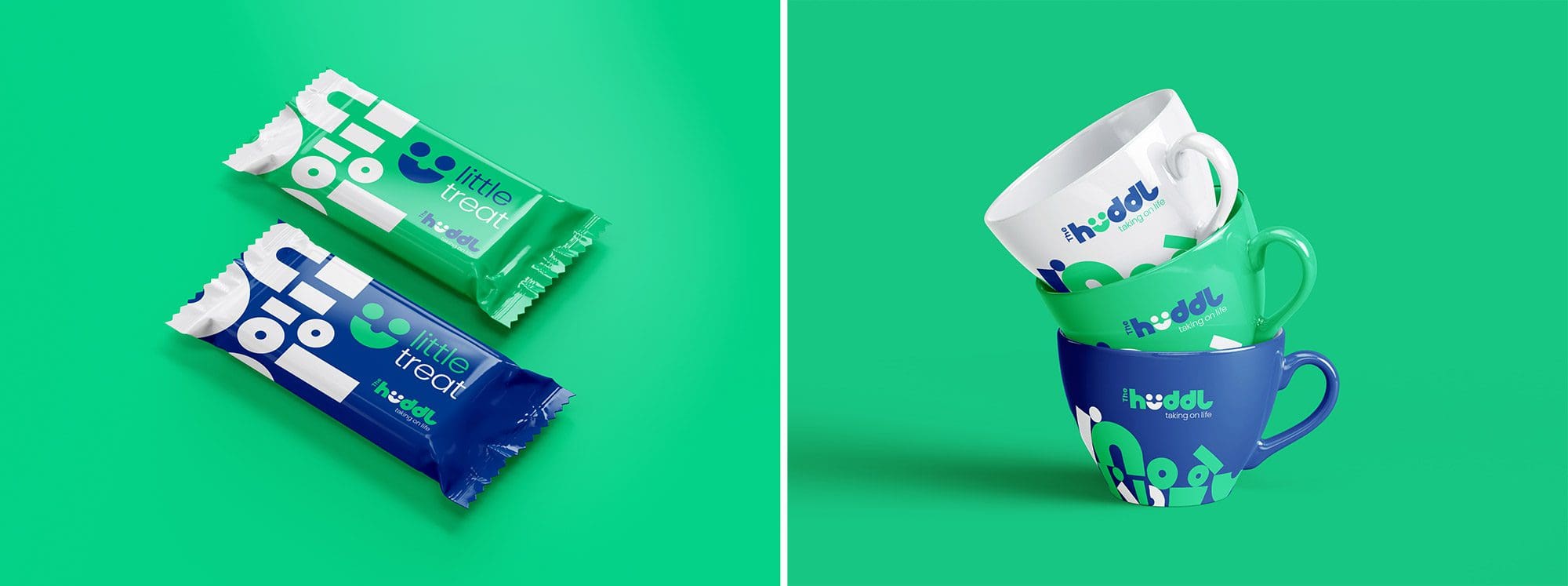
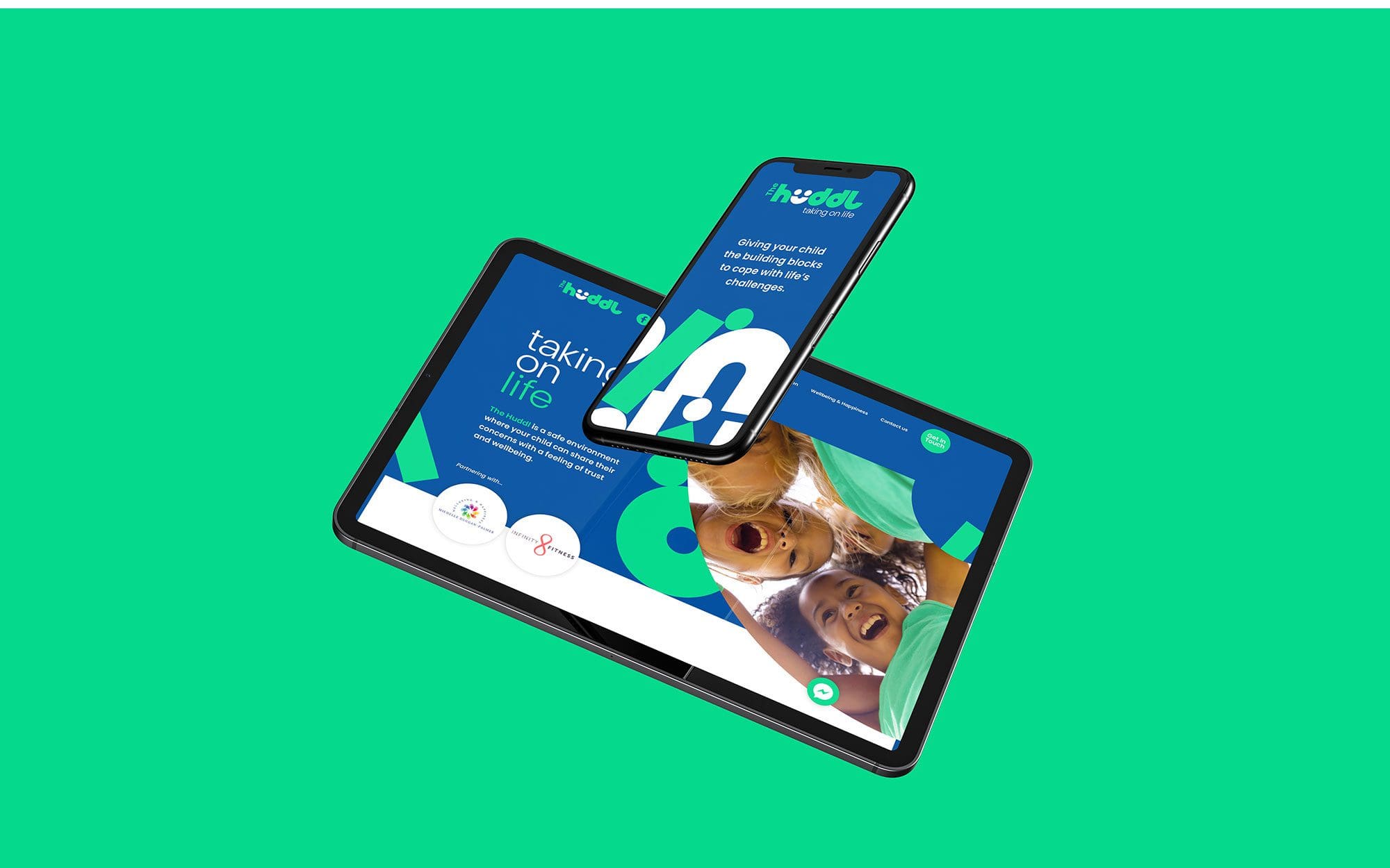
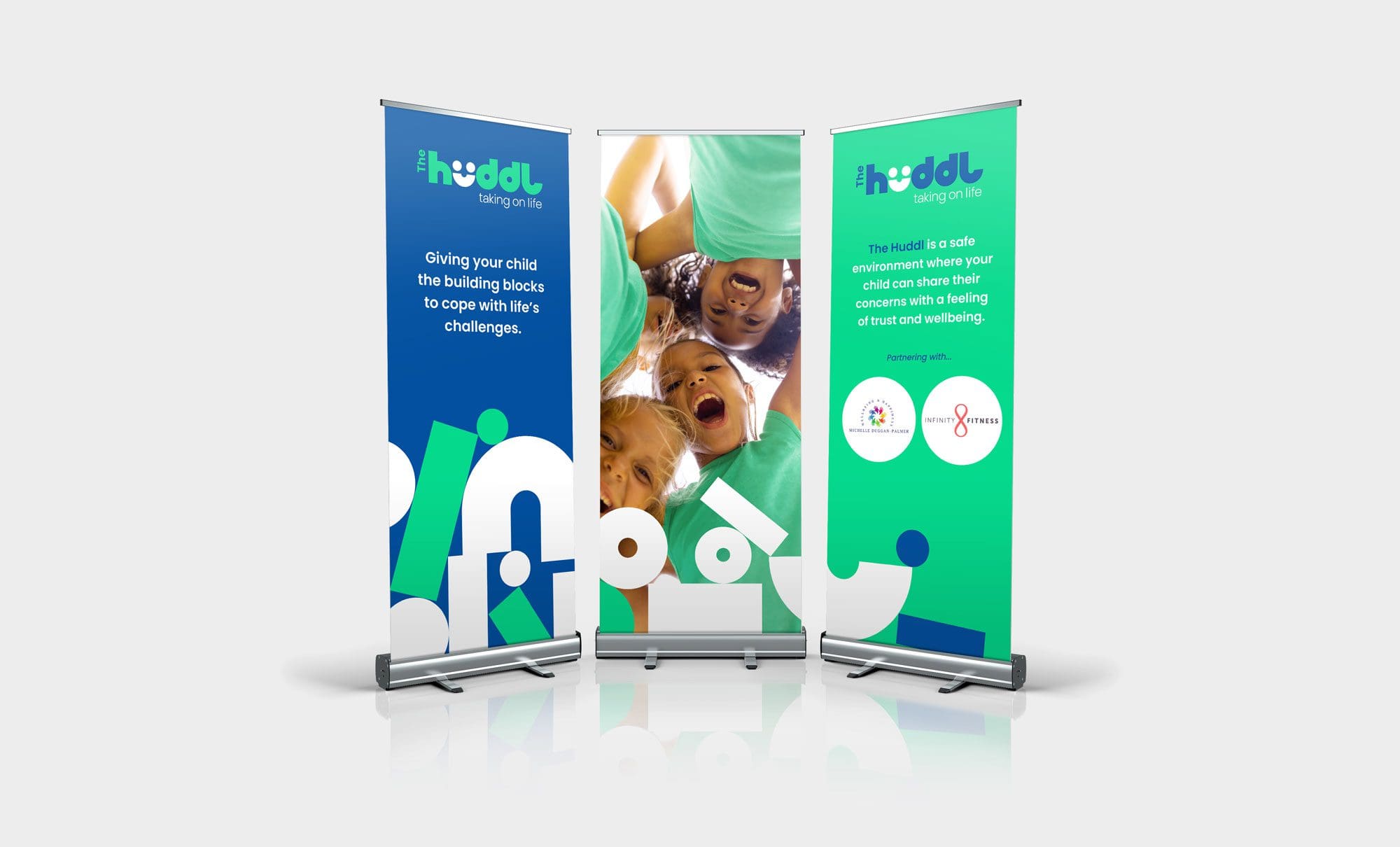
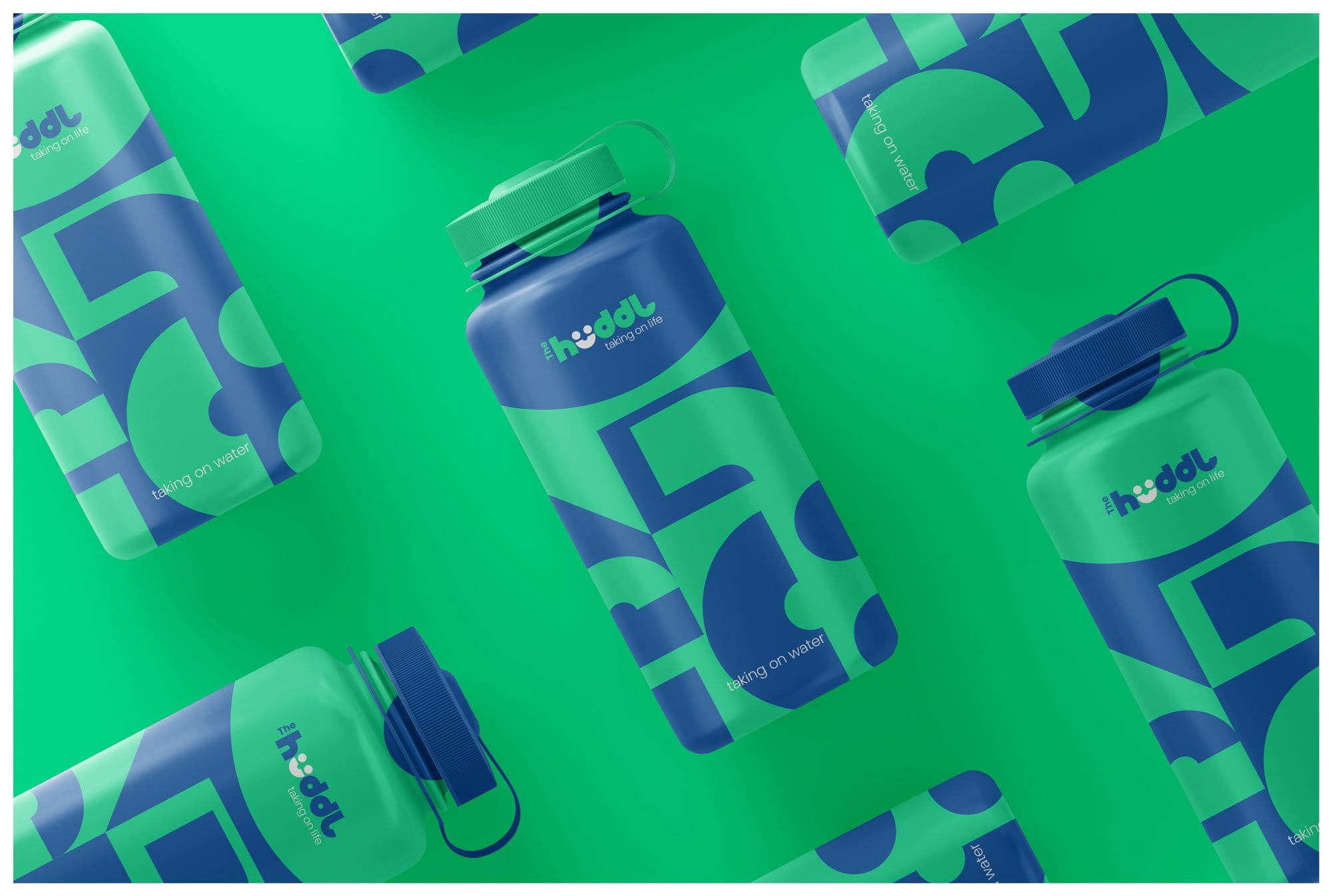
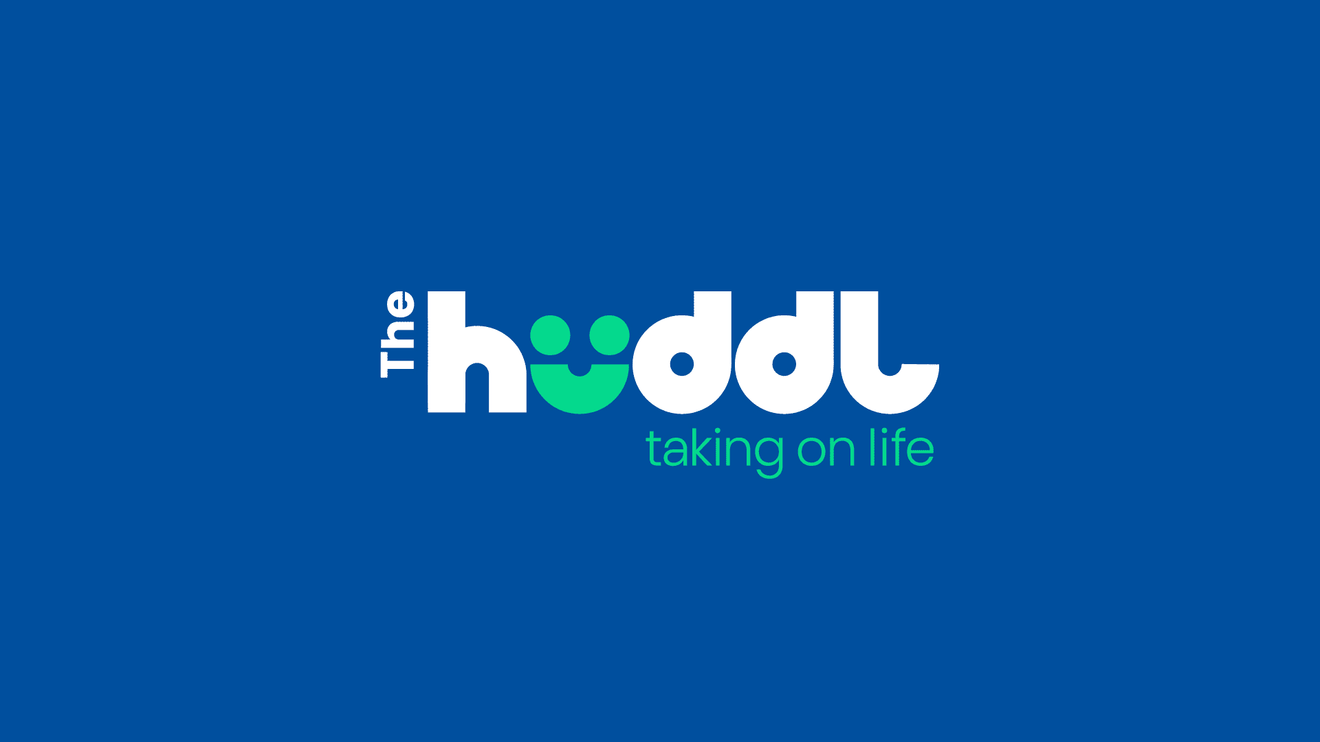
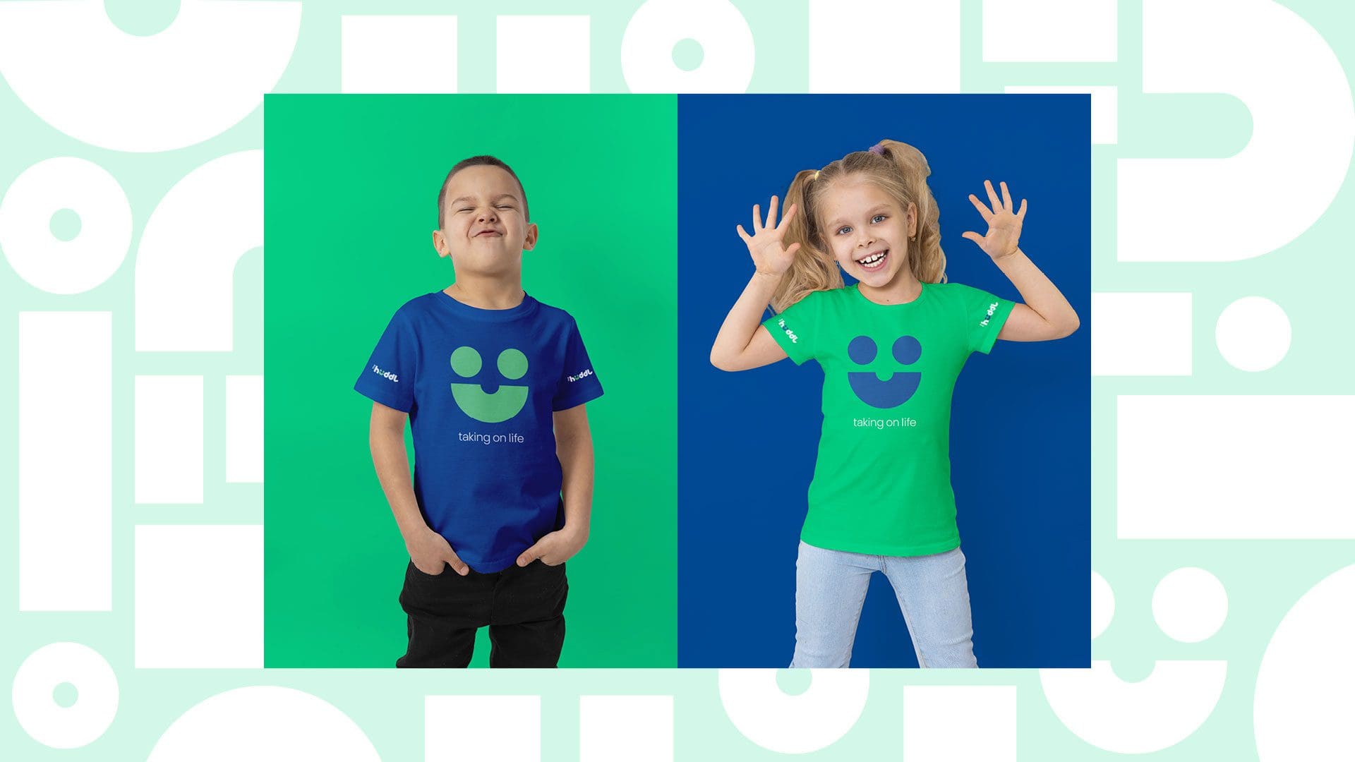
The typography came alive, with playful shapes resembling children’s building blocks, carelessly scattered before miraculously assembling into a symphony of togetherness. A mischievous icon, sporting a smile in place of the letter U, joined forces with a strong tagline, radiating positivity.
“The journey Cross Origin took us on is my favourite part of the process. The unwavering research and background that underpins the visual brand, combined with a solution that has left the entire team amazed and excited.”
Amanda Christensen – Fitness and Nutrition Coach
PROJECT SCOPE
Market Research / Naming / Brand Research / Visual Concepts / Brand Identity / Print Design / Animation
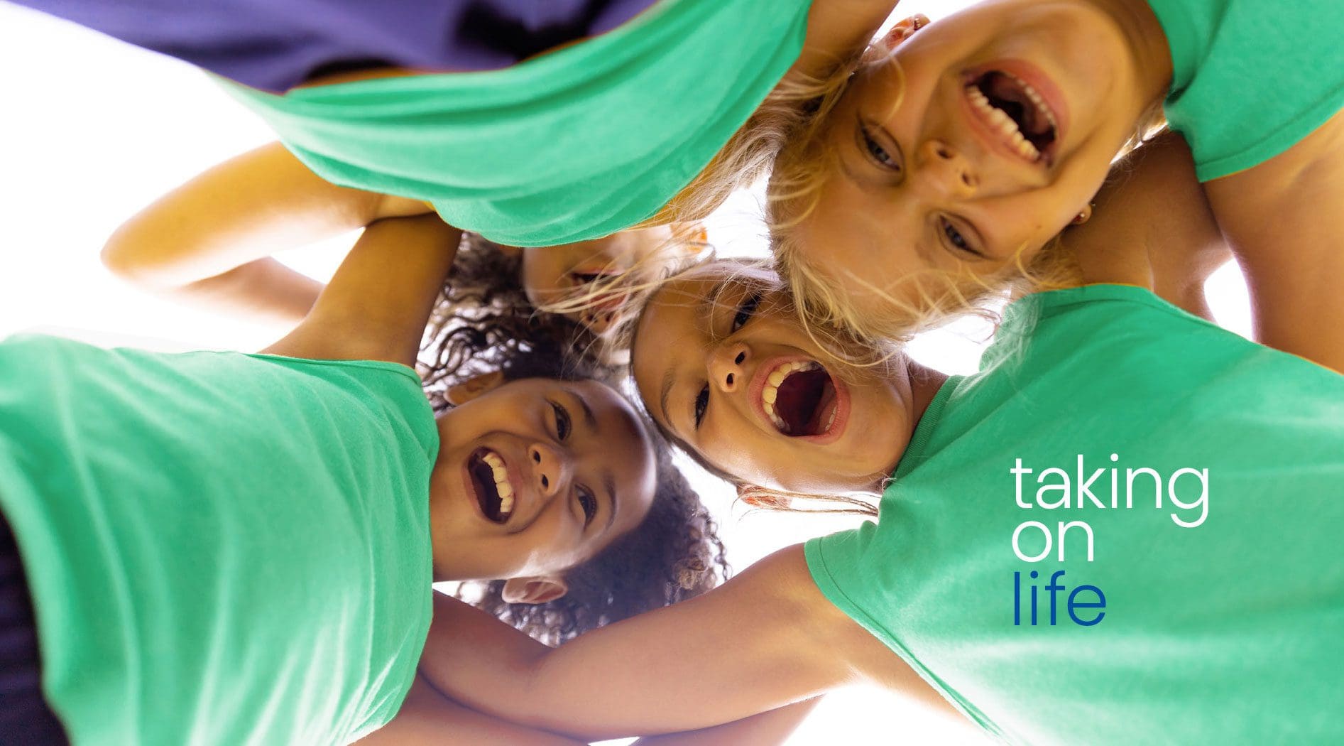


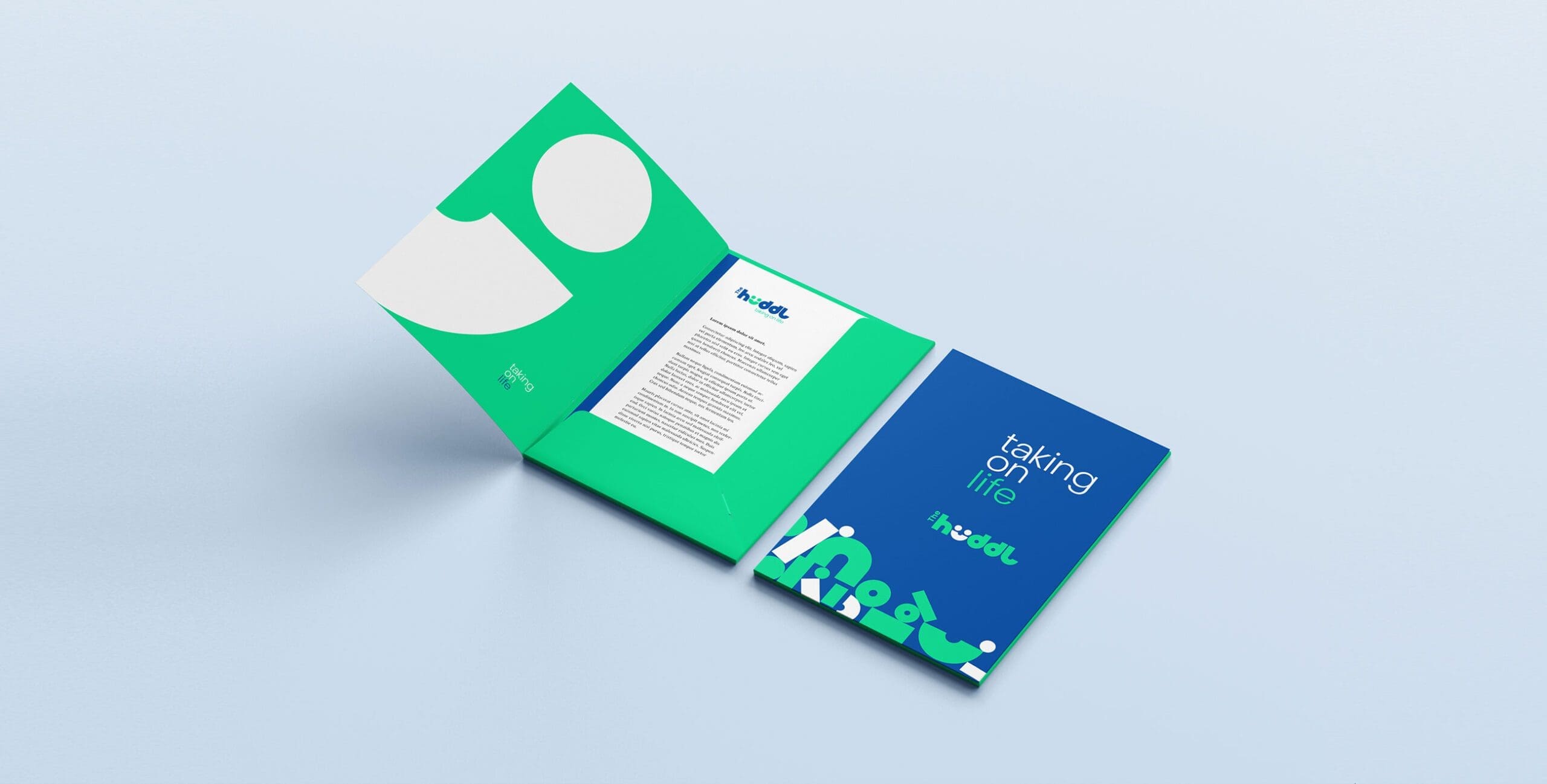

Giving your child the building blocks to cope with life’s challenges. The Huddl is a safe environment where your child can share their concerns with a feeling of trust and well-being.
