Upsilon Global - Streamlining Clinical Trials
The challenge
When recruitment is your biggest income generator but you need to redefine your market position because you deliver so much more. Upsilon Global approached Cross Origin to help make sense of their offer and deliver a visual brand that matches their expertise.
Our approach
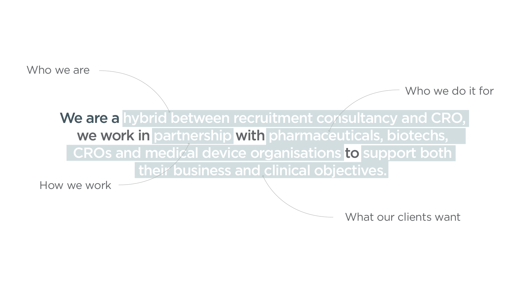
Upsilon Global belongs to an industry that takes some time to understand. In order to capture the essence of Upsilon’s USP, our discovery phase delved deep into their process whilst also exploring the directors’ ambitions for the business. We worked closely with stakeholders to define their value proposition and messaging pillars, which then became their core message. Communicating this visually and verbally is key to defining Upsilon’s brand position.
The outcome
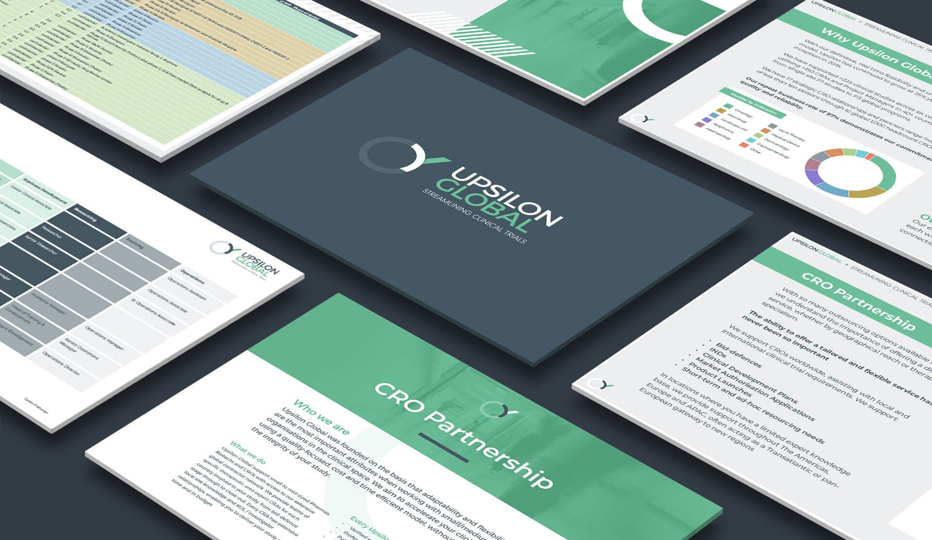
The name Upsilon is the 20th letter of the Greek alphabet, symbolising a split path or choice of direction. This gave us the basis for the icon in Upsilon’s new identity. In the icon you’ll see the symbol emerging from a circle, representing the company’s global position in the market. The refreshing jade green we’ve chosen to contrast against clinical greys is unique amongst Upsilon’s competitors and gives a feeling of trust and confidence.
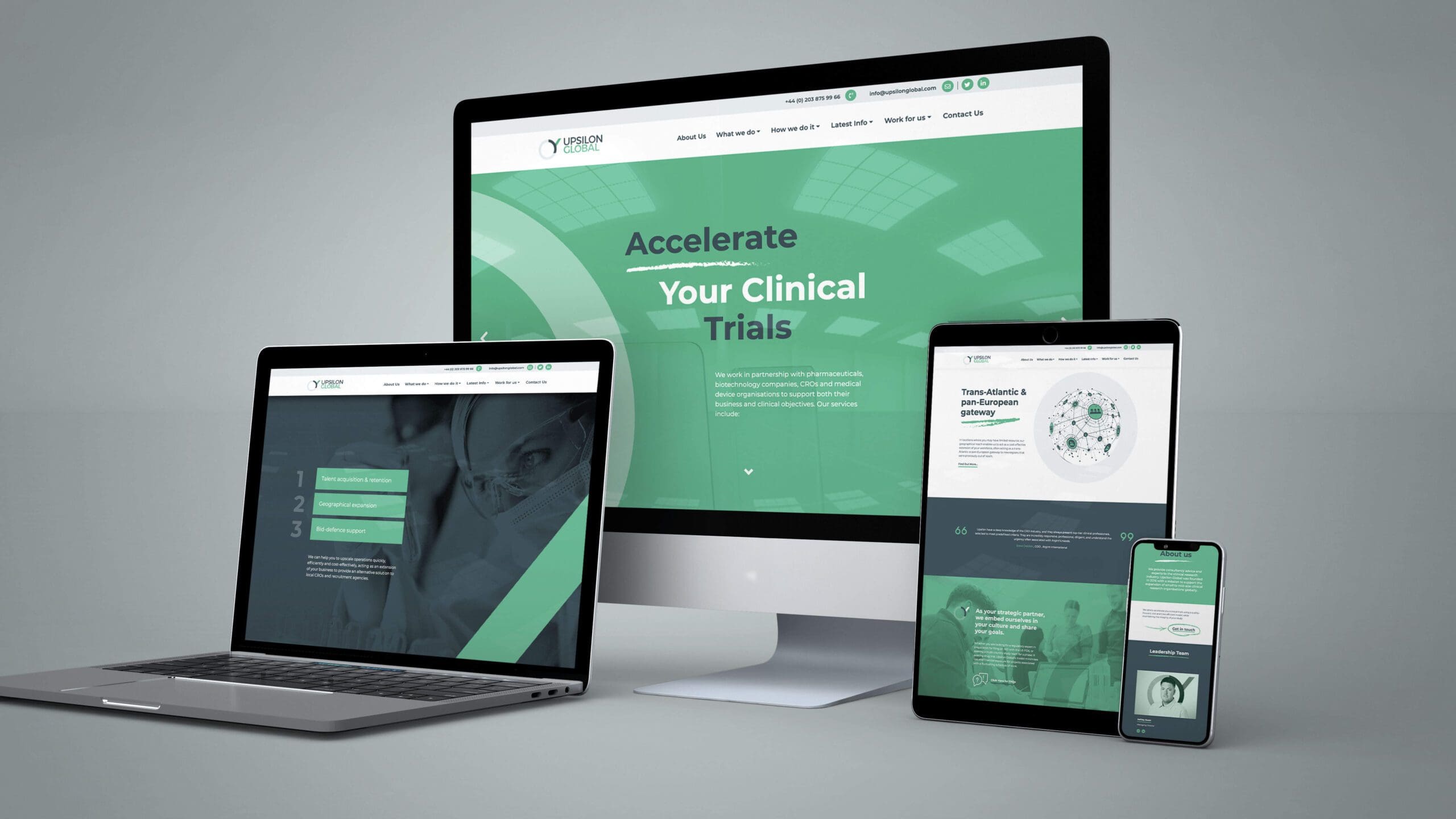
“Cross Origin helped us communicate our offer and prioritise our core message, with a visual brand that allows us to stand head and shoulders above our competitors. They analysed how we create proposals and communicate to our clients and proposed an innovative way of migrating this process online, tying it into our website. The process takes a lot less time and looks far more professional, reducing the need to send large documents via email.”
Ashley Swan – Managing Director

PROJECT SCOPE
Market Research / Brand Research / Visual Concepts / Brand Identity / UX-UI Design / Website Development / Print Design / Documentation Design / Signage


