Solo Property Group
The Challenge
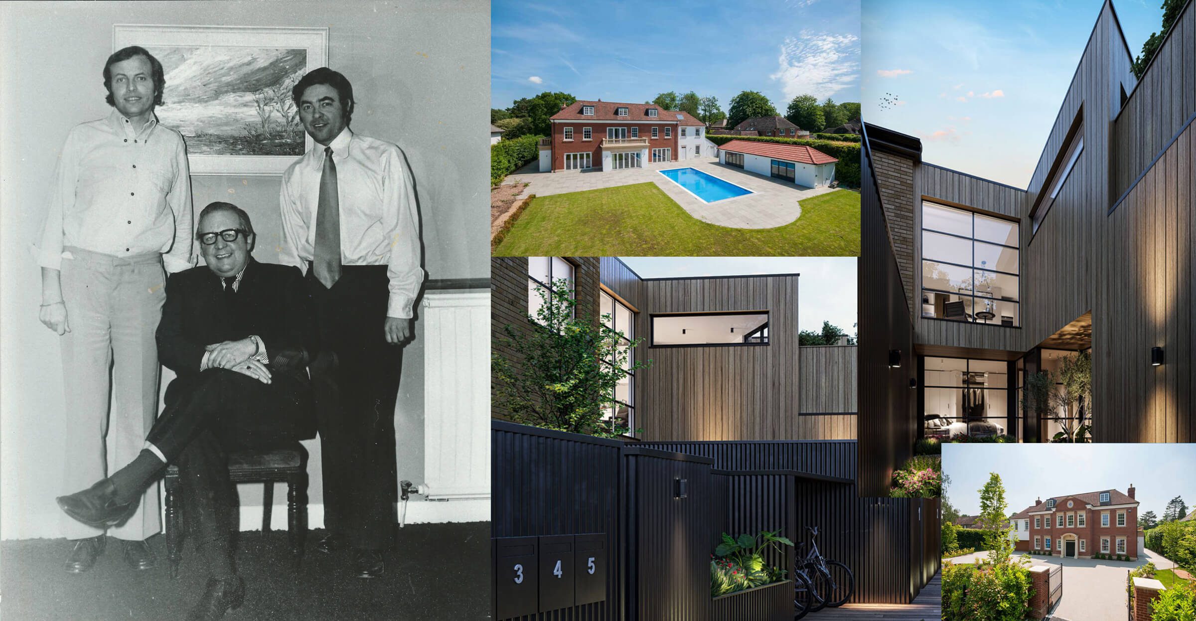
It’s common to see branding projects evolve when a family inherits a business and the next generation steps in to make strategic changes. Solo Property, a successful property company with over 50 years of experience recently recognised the need to create a cohesive visual brand structure. By visually unifying its four companies under one umbrella brand, it will successfully reposition itself as a forward-thinking property investment organisation. This transformation not only honoured their legacy but also set them up for future growth and innovation.
The Approach
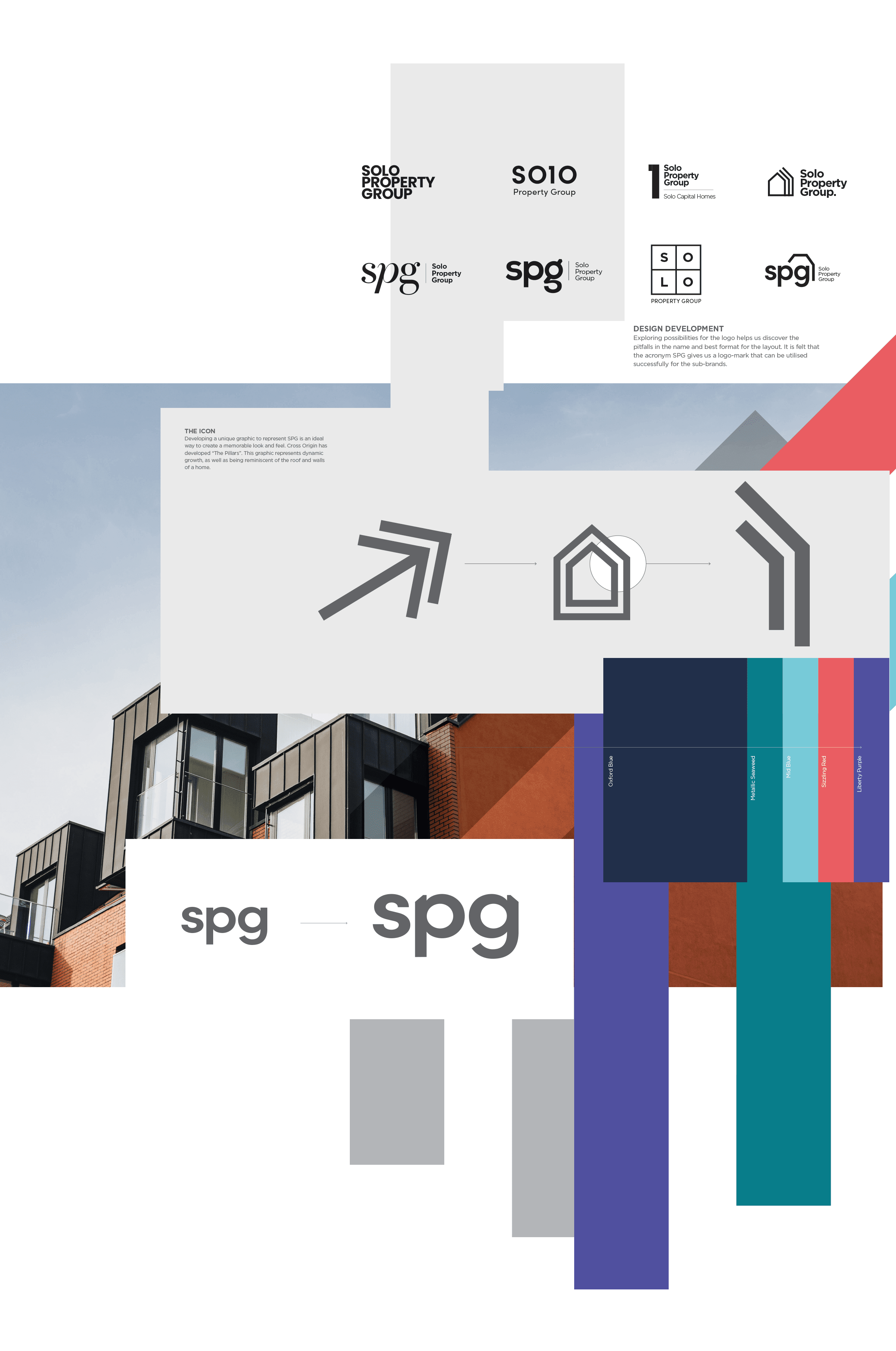
After spending time with the owners, delving deep into the family history and understanding their core values, it became clear that restructuring the umbrella brand and refining the naming conventions for the sub-brands needed to be the focus. It was crucial for each sub-brand to feel connected to a unified visual identity while still maintaining the independence to stand out on its own. This required expert craftsmanship to create an overall aesthetic that not only respected the family’s legacy but also embodied a bold, forward-thinking vision.
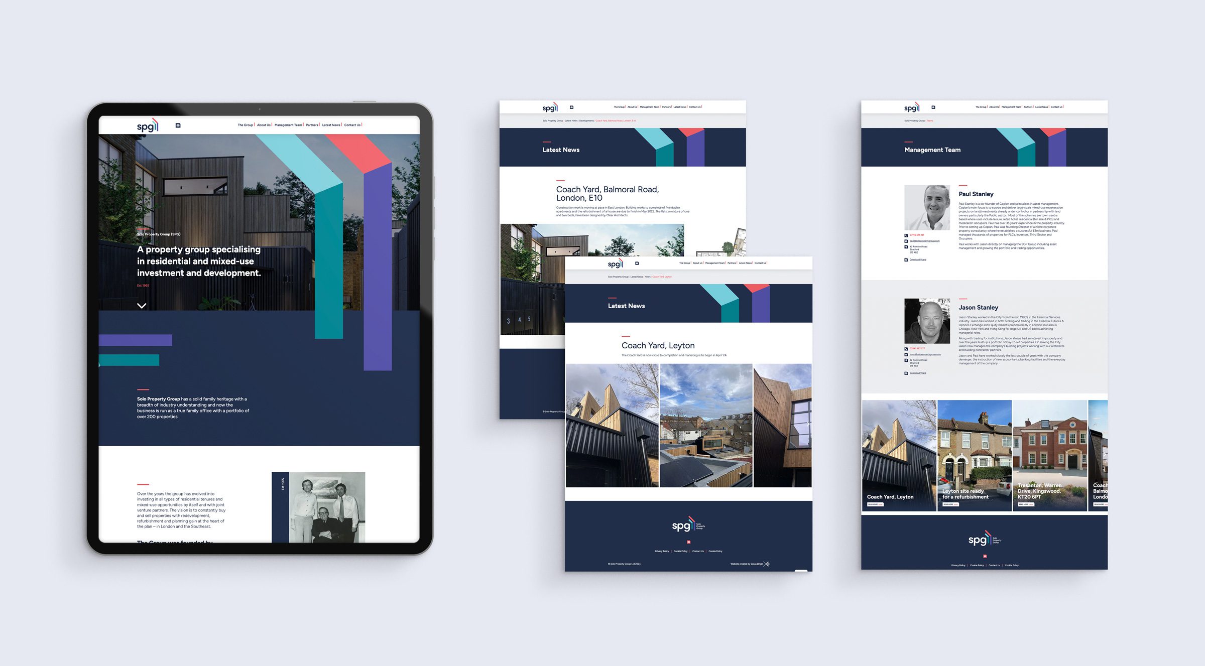
Project Scope
Brand Research / Visual Concepts / Group Brand Identity / Website Design & Development / Motion Graphics

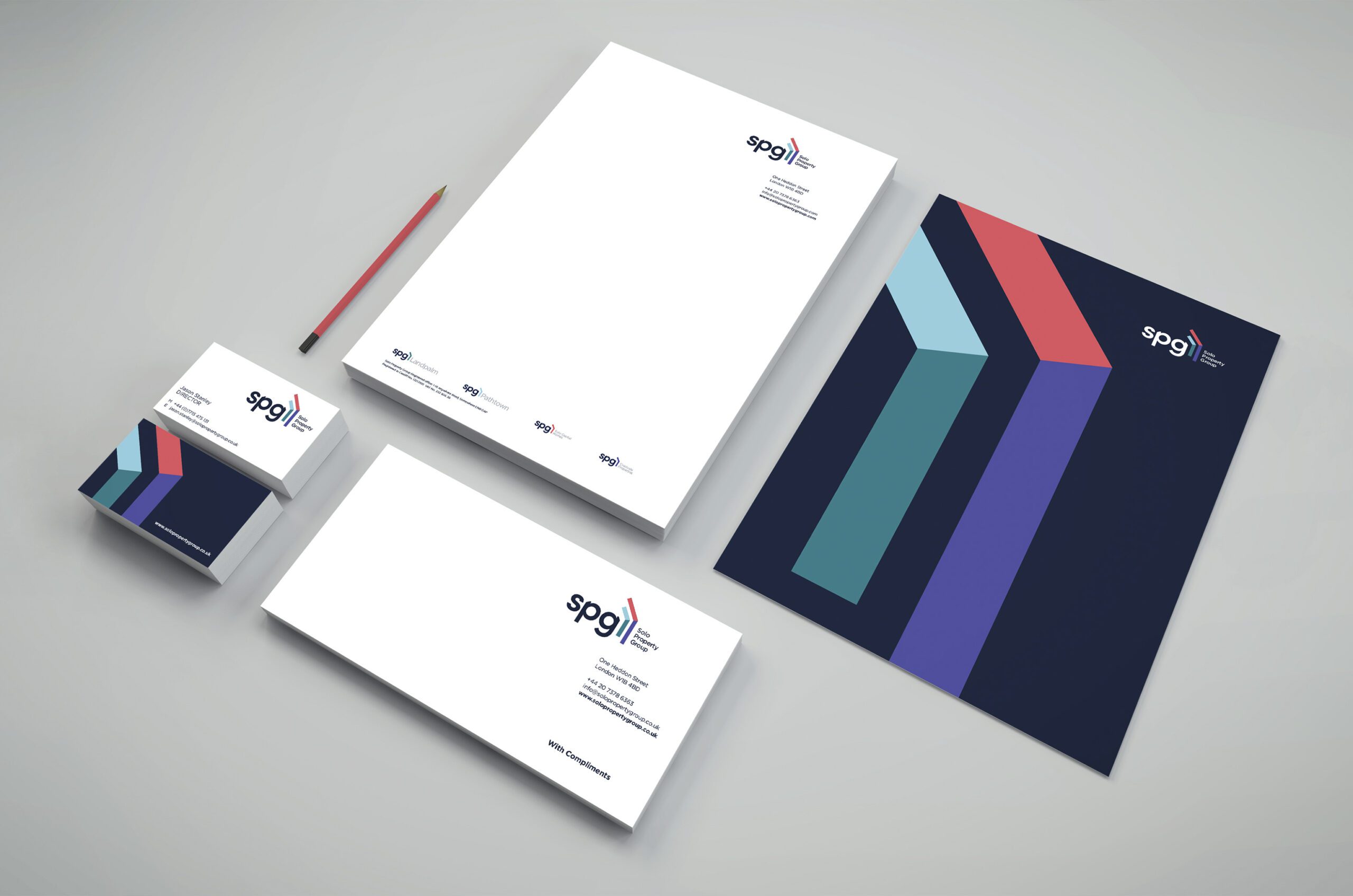
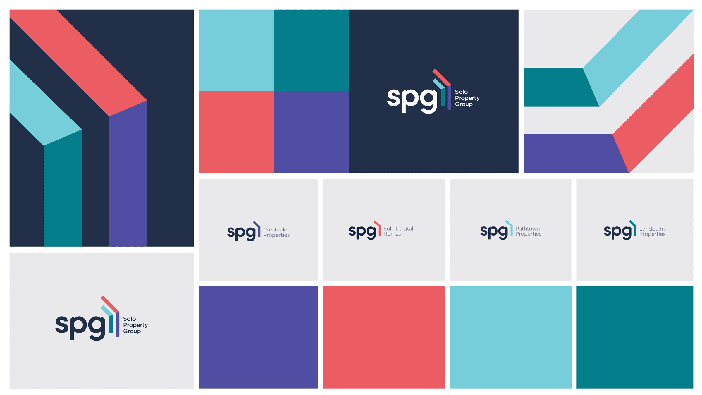
The Outcome
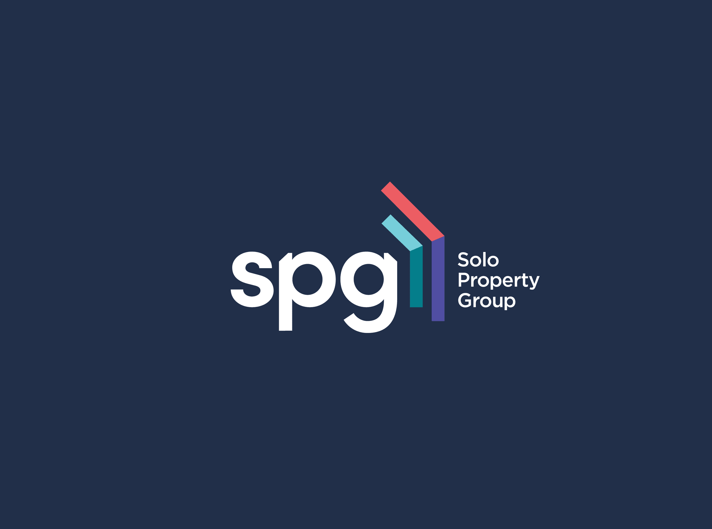
SPG is symbolically shielded by ‘the pillars,’ a graphic element that embodies dynamic growth while evoking the protective structure of a home’s roof and walls. The typeface is meticulously crafted to complement the shape and enhance the forward momentum of the brand’s graphic identity. These pillars provide a visual framework that seamlessly integrates the naming conventions of both the umbrella brand and its sub-brands. Additionally, a striking colour palette is designed to be divided, representing the four companies that make up the group, ensuring each retains a distinct yet cohesive identity.