Autism West Midlands
Lead with Creativity
A rebrand is more than just a new logo—it’s about crafting a visual identity that tells your story and connects on a deeper level. Since people absorb visuals way faster than text (seriously, 60,000 times faster), getting your brand’s look and feel right is a game-changer. Our mission? To create a unique visual system for AWM that’s not just eye-catching, but truly reflects who they are—authentic, memorable, and impossible to ignore.
Uncovering the Core Message
Since 1985, AWM has been living and breathing its values, constantly evolving to meet new challenges. To uncover a key attribute that could serve as the foundation for a strong visual language, we had to dig deep—unravelling decades of care, commitment, and unwavering support. Their open, passionate nature, combined with a wealth of experience, made one thing clear: they don’t just embrace change—it’s evident in everything they do, not just for themselves, but for the people they support every day.


Empowering Change
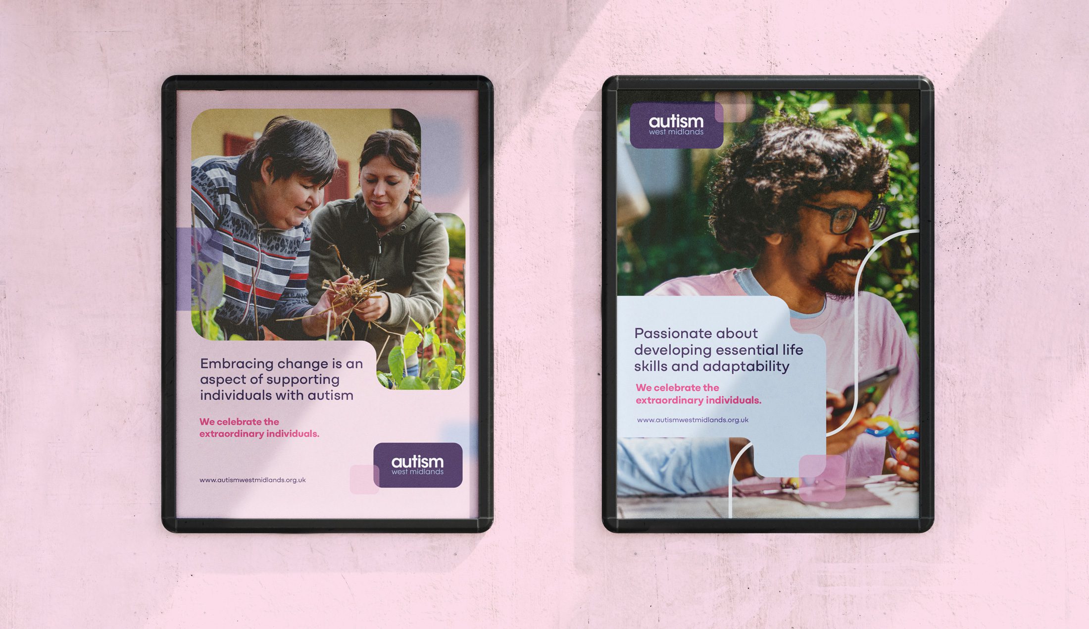
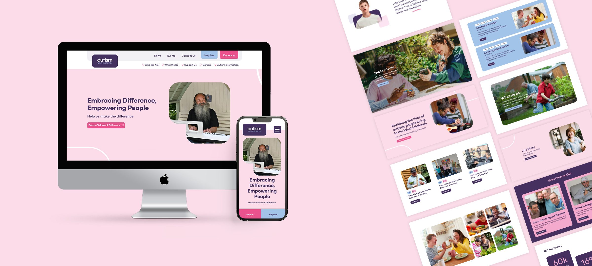
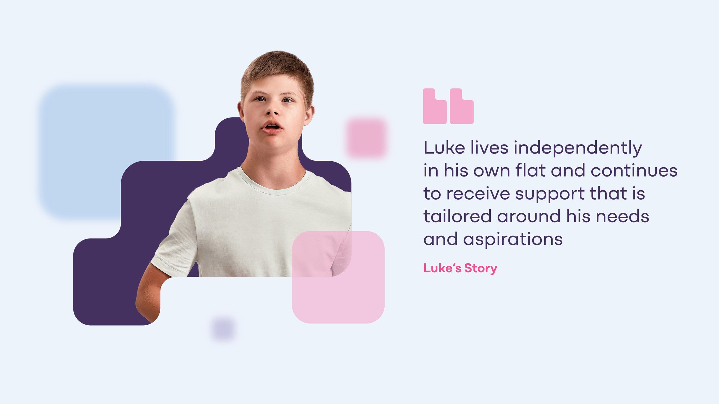
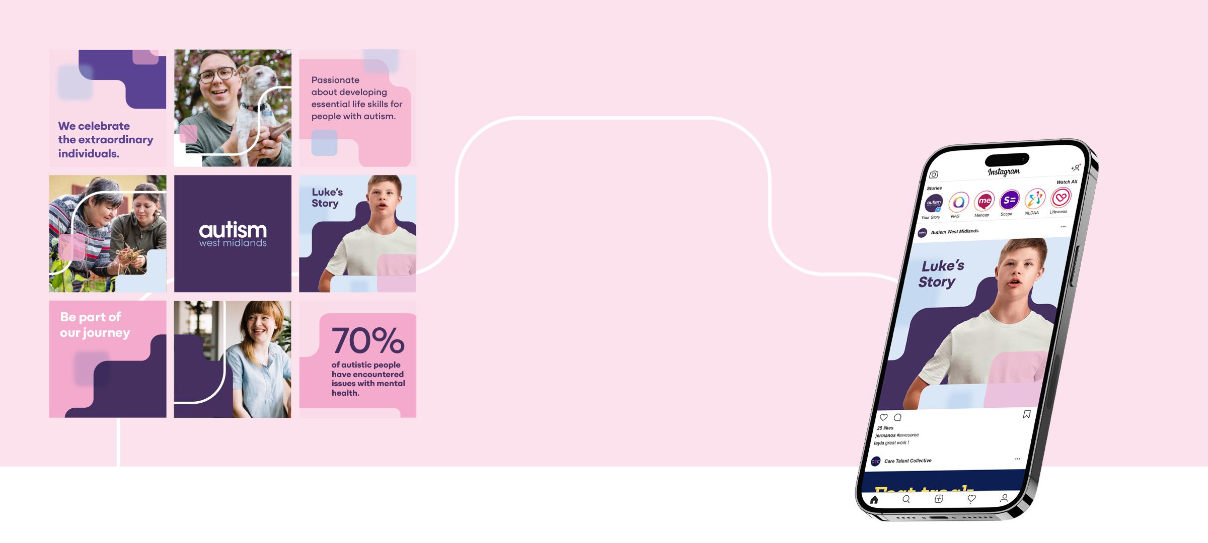
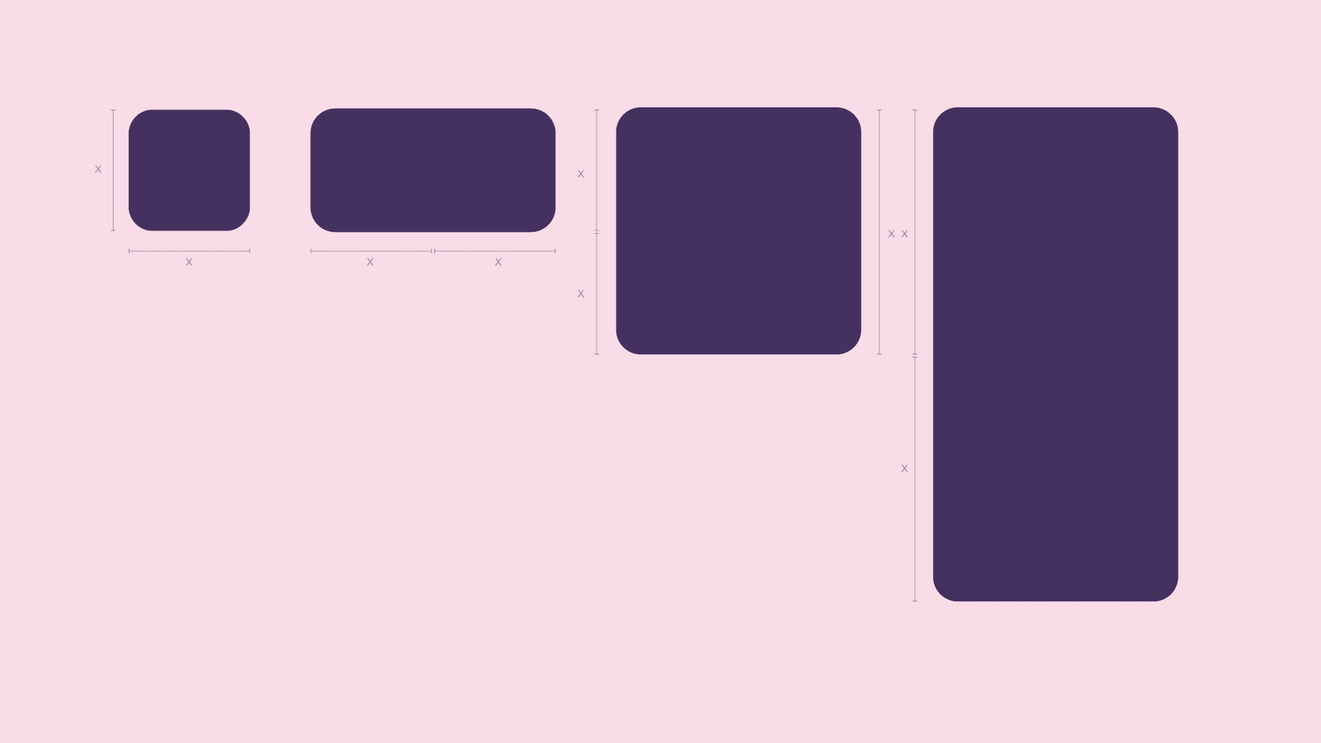
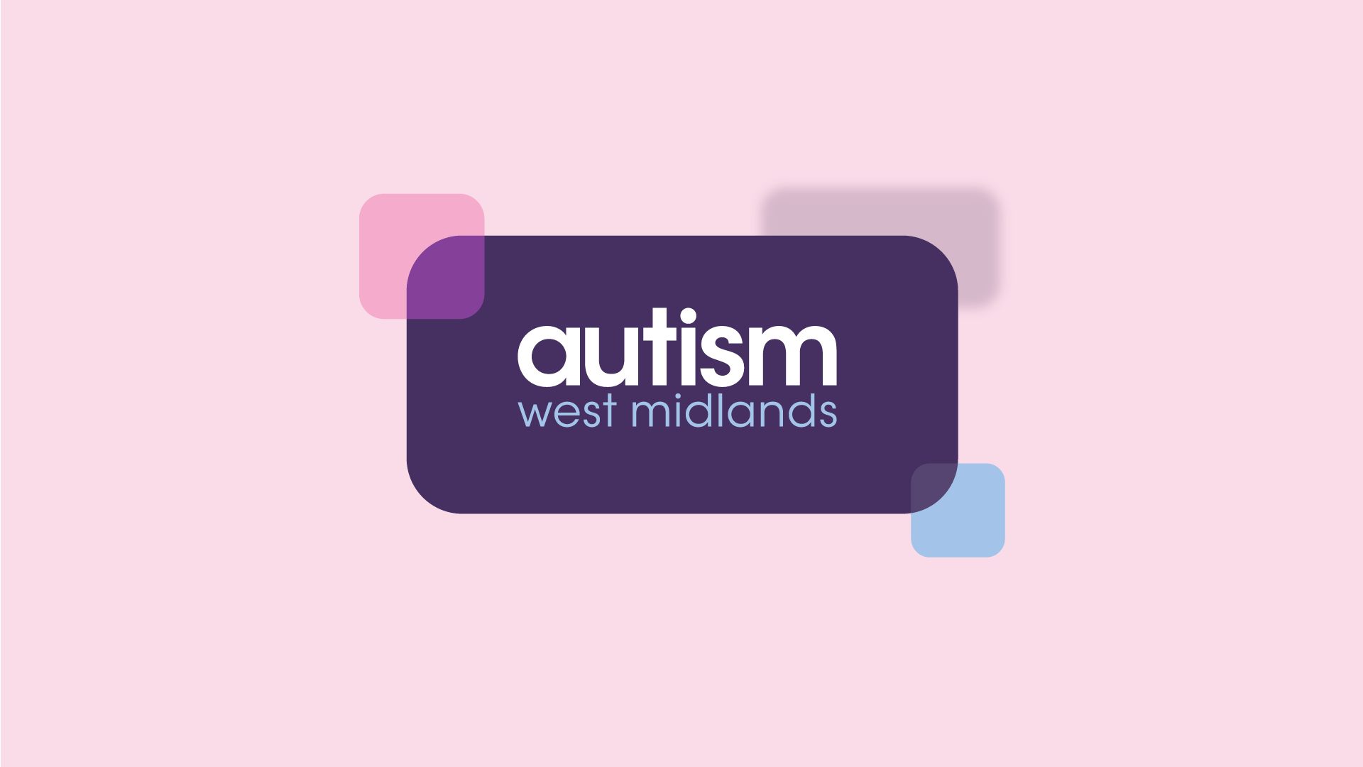
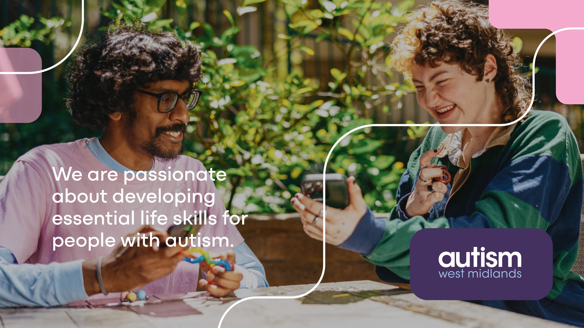
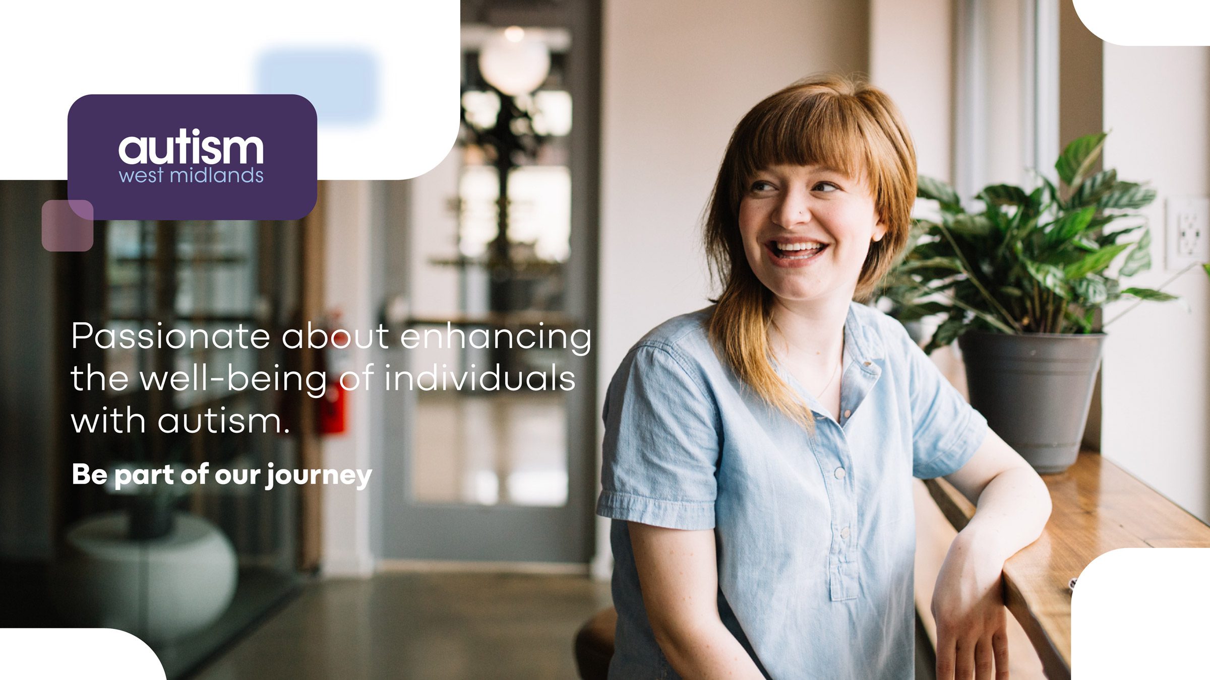
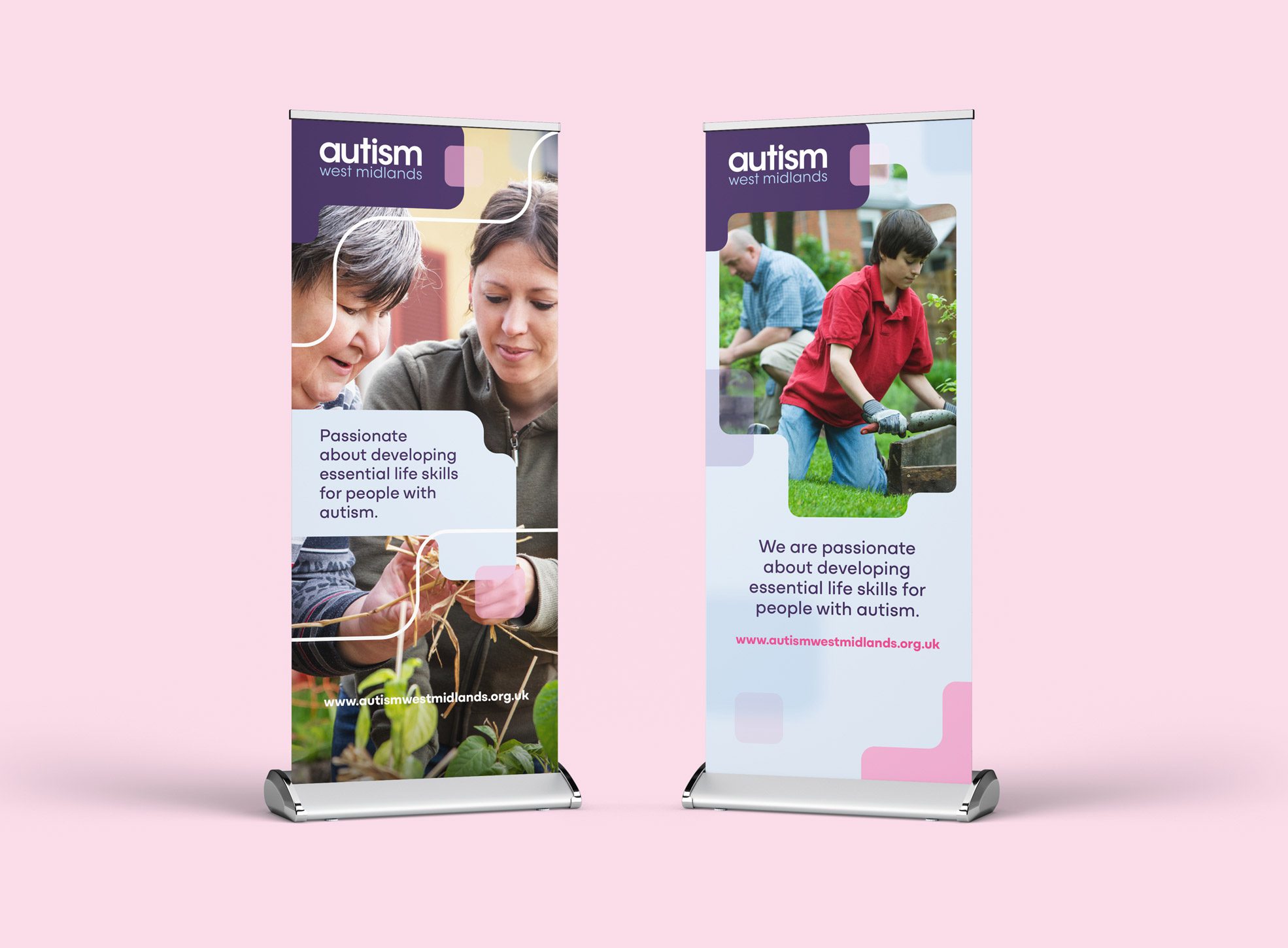
AWM’s brand identity is all about adaptability—it uplifts its environment and embraces change. The soft, merging shapes reflect understanding and flexibility, creating a unique visual language.
The brand’s geometric shapes are used to frame messages and hero images, building connections within the layout that guide the audience through a story, enhancing brand recognition.
“Our passion and expertise to enrich the lives of autistic people and those who love and care for them”
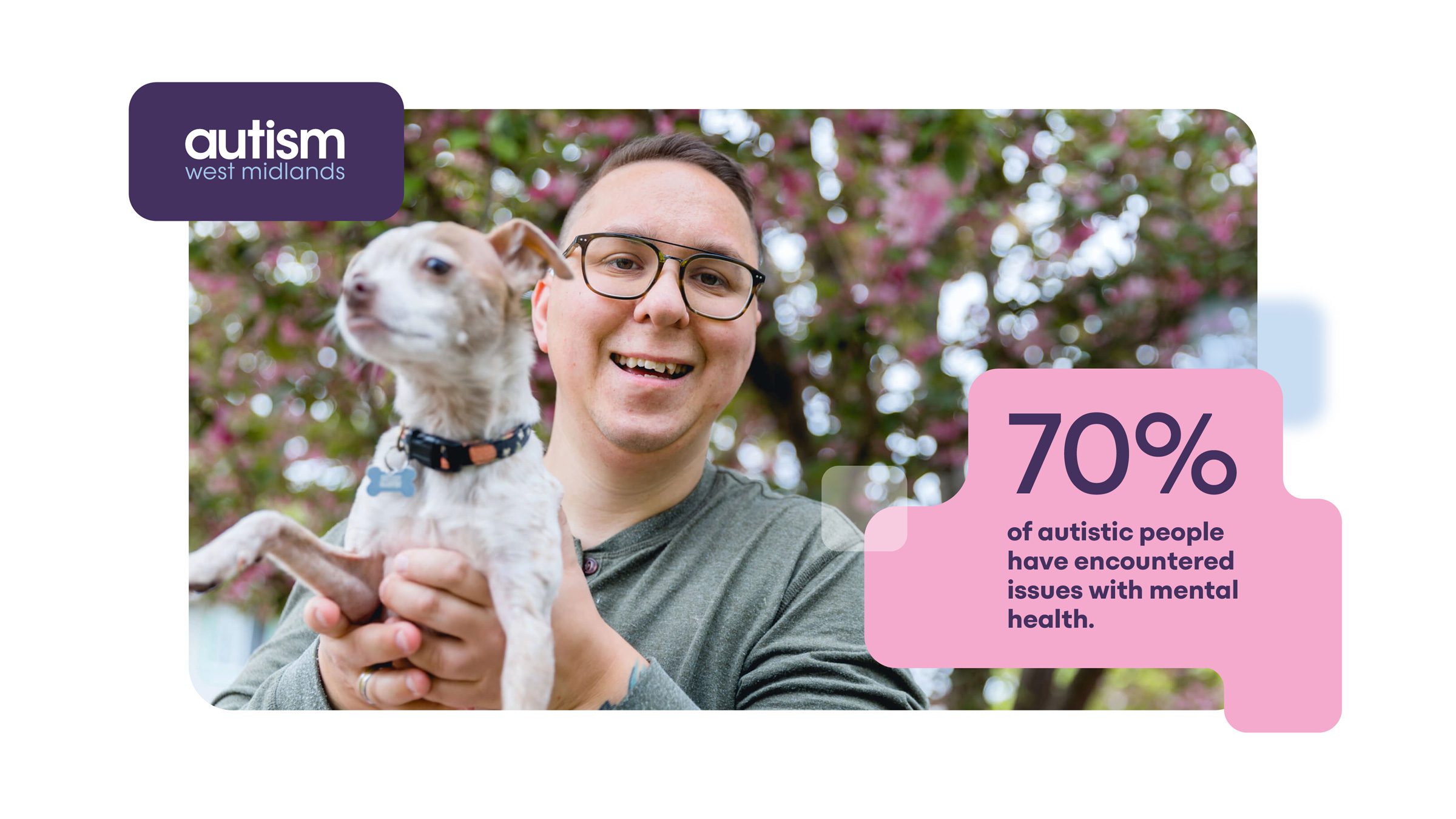
There are around 700,000 autistic adults and children in the UK. 60,000 of these live in the West Midlands.